What is considered “cool” is constantly changing in website design. Hot design elements of the moment can soon be considered to be “played out”. The love of retro has been around for decades but there has been a really strong surge recently, from tattoos, to old cars and furniture, to things on a large scale like architecture. It makes sense then that retro website design is the new seriously hip. So designers, do away with following the current trends and look to the past for inspiration. Retro website design offers the dream of avoiding a whole website re-design in a few years time.
This post is aimed at all you suffering from the condition Retrophilia; the love of all things retro. If you are not already showing signs of retrophilia, the mere viewing of this article will undoubtedly spark your interest in the quirky and attractive realm of retro website design.
What follows is 10 really great retro themed websites that I have found during my many hours on the web. Enjoy!
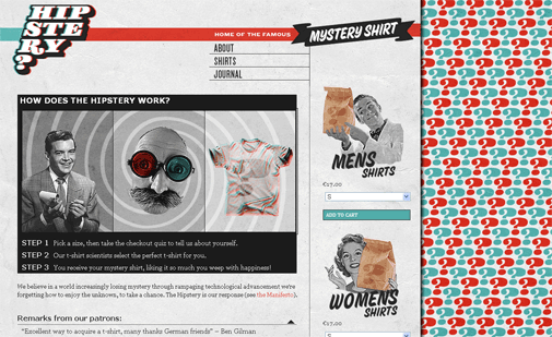
Super retro styling is abound at The Hipstery website, where you can buy mystery shirts from different sources. This is their punchline: Offering the finest t-shirts known to man, without man actually knowing them. Put simply for the simple – Mystery Shirts. The Hipstery liberates you from the burden of choice.

The image shown left is a nicely designed piece of retro internal advertising on The Hipstery. Little humorous gems like this advert pepper the site and add to the whole appeal. I must saying I’m loving the use of the old 3D glasses.
Can you tell yet that I love the design of this website? This website could stand the test of time…until everyone realises how great it is and copies it.
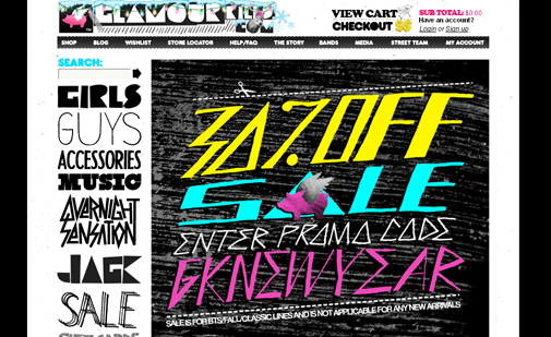
If there had been an online t-shirt store in the 80’s, then the design of it would have probably looked like Glamour Kills. Now for those of us that remember first hand the fashion disaster that was the 1980s (eek I’m showing my age), and cringe now as more and more of those trends seem to popping up, you’ll definitely wanting to avoid the 80s look. Use of the Miami Vice shades of colour can be good, but never, ever perm your hair.
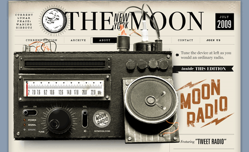
The New York Moon website has a classic feel, styled after an old newspaper. Sometimes it’s just the small elements that capture our interest, I love the fact that the controls on the vintage radio work! I’m listening to “A Festival of Death” as I write this from Moon Radio.
Edgewater captures the look of the vintage travel posters of yesteryear. The romance of the perfect life, captured perfectly. It has a slightly unpleasant “The Stepford Wives” feel with all the perfectness but maybe that’s just me.
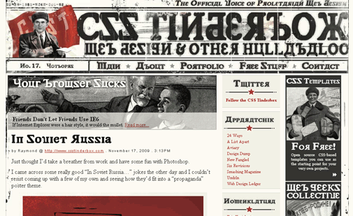
CSS Tinderbox offers up a Russian Retro design. Very nice use of vintage images and dirty textures. This website wins extra points for the article “Friends Don’t Let Friends Use IE6”
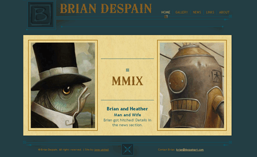
The old style typography and muted tones of colour used add to the retro feel of the website of Brian Despain Art. The super beautiful line detailing has an art deco feel too. If you have time I highly recommend you browse his absolutely stunning gallery.
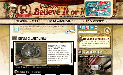
Ripley’s website is cleverly designed with a lot of retro elements. Very original and obviously a lot of thought went into the design. I like how the RSS feed link is an old looking tag.
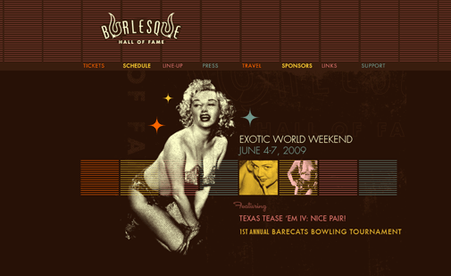
Burlesque Hall of Fame will appeal to the retro purest. The old looking image of the woman with the halftone shading, the colour palette used and those shapes and lines. It has a classic Las Vegas feel.
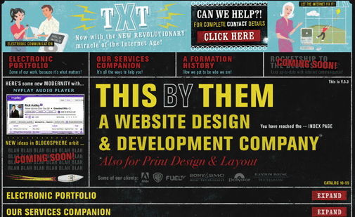
This By Them is a hot little number. Great retro design.
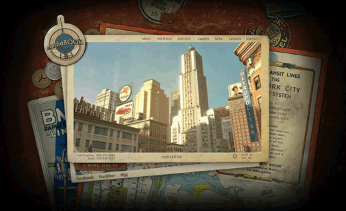
mediaBOOM another stunner complete with music!
Tags: inspiring designs, Retro Website Design Inspirations, retro websites



Retrophilia! Love it.
I run a 80s website, and from your list I have only seen one of these before (the Ripleys site)! Might check out the others as they look really cool.
Wow!!! very uncommon