E-commerce websites continue to evolve. Design versus function is paramount in e-commerce design. The ultimate goal is sales, so it is much like an actual “real” store.
Can the shopper find the item they are after easily? Are the products shown in the best light (attractive photography)? Are the website visitors shown an array of products to possibly tempt further purchases (opportunities for add-on sales)? Does the website appeal to the target audience (is it “cool”, or technical)? Is the check out process easy? Can the website be trusted?
I’ve put together a list of 10 interesting e-commerce websites that I find appealing for one reason or another. I think all are aesthetically pleasing to some degree and there is a variety in design and function. Obviously this is only my personal opinion and tastes differ, so check them out and feel free to agree or disagree to the merits of each website.
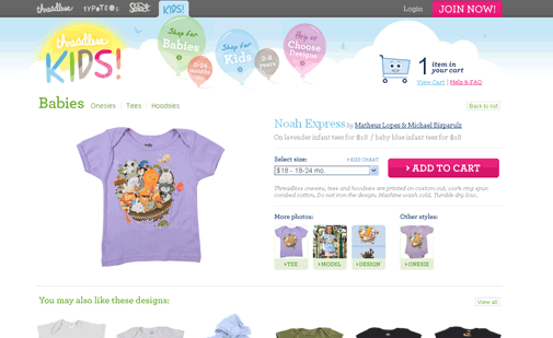
Threadless Kids -The Threadless Website is a huge e-commerce success story. I like the design especially of the their kids store. The design offers a nice pastel-child friendly look. I also like the design of the original shopping cart. The landing page isn’t over-cluttered. The photography is superb and you are immediately shown a variety of designs. The website invites the shopper in, much like a good store front draws the pedestrian in off the sidewalk. I think this website illustrates a highly successful mix of design and function. I would shop here (actually I do shop here).
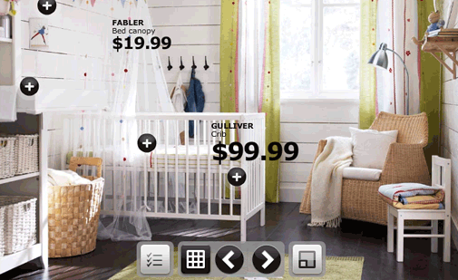
IKEA -Straight from their original print catalogues, you get images of complete rooms featuring a vast range of Ikea products. Interior design made easy. If you visited this website to buy, say a bed, it’s easy to see how you might just want to get the lamp and the bedside table as well…can you say add-on sales!
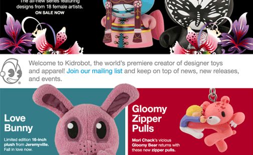
Kidrobot -The landing page offers a nice overview of some great looking products. I love the contrast between the rich, colourful photography and the white and grey. Nice large font size for a modern look. Very nice.
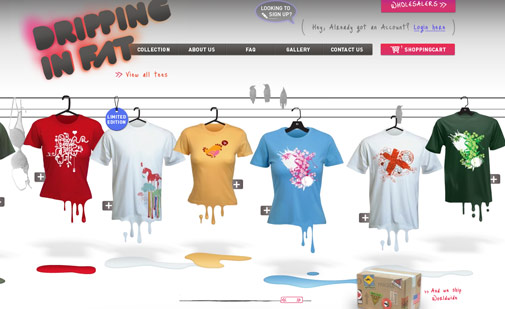
Dripping in Fat -I know, some of you reading this are going to complain about the use of Flash, but the design is very nice, if a little slow. The product size selection may not be intuitive and might prove difficult for the less frequent web user, but then they’re probably not the target audience. It’s great to see an individual in a sea of cardboard cutouts (or templates).
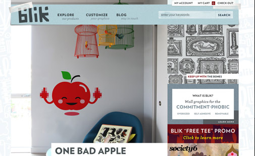
Blik -Love, love, love the design of this website. The texture effect of the sticky tape for the top navigation, and the 3D collage effect are visually appealing. Nice use of fonts. Love the product photos and display. The left navigation is easy to use and the accordion style keeps the page from being too busy.
Icon Dock -Love the drag and drop functionality of the shopping cart. The website visitor can start shopping immediately by adding icons to their cart from the homepage!
![]()
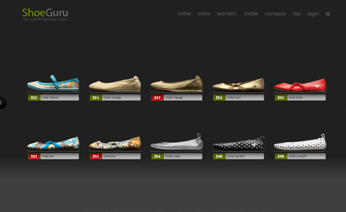
ShoeGuru -Great design with the stark black there is nothing to detract from the good looking shoes.
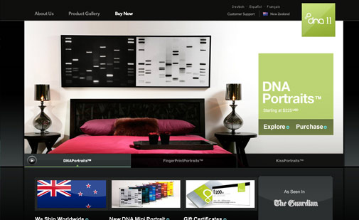
DNA 11 -So many website are now selling to a global market rather than being limited to a specific country, so I like it when I visit a site and it knows that I’m in New Zealand. The other thing that this site does very well is it doesn’t overwhelm the viewer with choice, rather it’s more of a step by step reveal of the variety of products available.
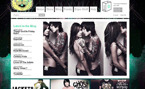
Drop Dead Clothing -Killer photography and model selection. This shop oozes with the “cool” factor. Clear navigation for the website visitor and again I like the shopping bag in place of the tired, old pixel shopping cart.
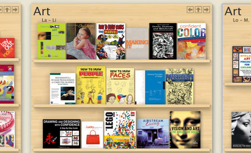
Zoomii.com -I added this website in because it is definitely interesting. It might not be the fastest way of finding a book but it does give the shopper a real bookstore experience. I think this is definitely a glimpse at the future of online shopping. This concept works incredibly well for children’s section, also art books and comic and graphic novels.
Tags: E-commerce Website Design Inspirations, e-commerce websites, inspiring designs




wow amazing write-ups
Great article and great site summaries. While it’s important to showcase products/ services in the best light, and site functionality/ navigability is paramount– driving the sales through completion is the ultimate goal– with as many up-sells as possible. The site also has to offer something that keeps consumers coming back for more, or sharing the link with friends. You’re onto something because your examples demonstrate eCommerce success is so much more than great site design.